Inverted Yield Curves, Rolexes, Ties & Unusual Economic Indicators
While market timing to predicting a crash or future recession is a fool’s game, it’s difficult to avoid media and headlines covering the bases with major leading market and economic indicators, otherwise the many unusual indicators that may be more useful for clickbait or a drinking game than practical application.
Indicators du jour
Major leading indicators provide insight about the state of an economy and whether it is in expansion or contraction. Most are delivered by government agencies and provide tight data points on activity in the previous month and year. Top Ten US economic indicators include tracking GDP, employment, industrial production, consumer spending, inflation, home sales, home building, construction spending, manufacturing demand and retail sales.
Unusual, if not superstitious economic indicators covered in the news should be taken with grain of salt when determining your next financial move. Some of the more prevalent ones include the width of men’s ties, lipstick sales, length of hemlines, men’s underwear sales, supply of cardboard boxes, price of Big Macs, the RV index and the Swiss Watch indicators, to the consumption of champagne, beer and aspirin.
Recession Indicators
If you’re trying to figure out how the domestic and world economy is holding up in the junior year of the current pandemic bull market, you probably feel like you’re spinning around on a roundabout at a playground. The V shaped market recovery over the past year leading to the 20% drop this past quarter in the NADAQ index is an example of irrational exuberance leading to irrational anxiety.
While consumer confidence (sentiment), GDP and employment indicators may provide some base-line tea-leaf predictions of a recession, of the hundreds of market and economic indicators that investors watch closely, an inverted yield curve has been viewed as an important key indicator of a pending economic fall-out. Not only does it summarize the state of the economy, but the level of interest rates across the yield curve directly affects investors, businesses and individuals.
These rates are important for those investing for portfolio income, taking out a mortgage, applying for a personal loan and more. However, the yield curve is arguably much more important as an economic indicator. This is because the shape of the yield curve tells us about the health of the economy and where we might be in the business cycle.
What an Inverted Yield Curve Indicates
It’s for this reason that markets had a mixed reaction to last week’s yield curve inversion as the short and long term rate lines crossed. This adds to investor concerns over inflation, the Fed, the war in Ukraine, and more. What does this mean for long-term investors, and could it be different this time?
Although the yield curve is a technical concept, the basic idea is easy to understand. A yield curve is just a graph that shows the level of interest rates across different time horizons, or maturities. In plain English, it tells you what interest rate you would earn if you invested in a new treasury note or bond issue for that duration, be it 3 months or 30 years.
Traditionally, economists and market professionals look at the difference between 10-year and 2-year Treasury yields. Since we often plot these yields on a graph, when the difference is large, we say that the yield curve is “steep” (it slopes upward to the right). When the difference is small, we say that the yield curve is “flat.”
The shape of the yield curve changes throughout the business cycle. Early on, all rates are low as the economy comes out of recession. Long-term rates then begin to rise as growth picks up, followed by short-term rates that are influenced by the Fed as it tightens policy. Thus, it’s natural for the curve to flatten over time, giving us a hint as to how far along the cycle may be.
Eventually, the curve flattens so much that it “inverts” – i.e., when it slopes downward instead. As of last week, the 10-year Treasury yield reached 2.38%, the 2-year 2.44% and the 3-month Treasury note 0.5%. The fact that the 2-year yield was higher than the 10-year is what signals this inversion to many. (see below) However, deciding how to measure and interpret this can be tricky. There are three important facts to highlight:
First, while yield curve inversions may predict eventual economic downturns, they don’t tell us about their timing. For example, the yield curve flattened significantly in the mid-1990s, remained flat for a few years, inverted for a period in 1998, then re-steepened. The bull market then continued for another couple of years before the recession in 2001. (see below)
Of the six recessions since the early 1980s, some form of yield curve inversion occurred anywhere from 9 to 23 months before, during which markets often performed well. Thus, yield curve inversions are a blunt tool that should not be interpreted as a market timing indicator. Instead, history suggests that being positioned properly throughout these events, with an appropriate combination of stocks and bonds, preferably with the advice of a trusted advisor, is much more important.
Second, the reality is that not much has changed for long-term investors over the past week. The flattening of the yield curve has been driven by well-known factors such as inflation, the economic rebound, ongoing pandemic outbreaks in certain parts of the world, supply chain problems, and geopolitical risk. Even the Fed’s rate hike was fully anticipated by the market, which is one reason that stocks have rebounded.
In fact, other measures of yield curve steepness have not inverted in the same way. While using 10’s and 2’s is common, comparing the 10-year yield to the 3-month shows that the short-end of the curve is as steep as it’s been going back to early 2017. Similar measures, such as the “near-term forward spread” which is also accepted as a recession indicator, is the steepest it’s been since the early 2000s. Other leading economic indicators have softened but have not turned negative. So, not only is the timing unclear, but which measure to focus on is often determined in hindsight.
Third, even with the curve flattening, real inflation-adjusted interest rates are still stimulative for the economy. In fact, all interest rates along the yield curve are still in negative territory once taking inflation into account. (see below) This may resolve itself as inflation cools and policy rates rise. However, negative real rates are usually viewed as accommodative for the economy, just as they were a decade ago.
Thus, the goal of any long-term investor is still to stay balanced throughout all phases of the market cycle, and not to focus on day-to-day changes in market and economic indicators. A recession is always possible and, in the longer-term, is inevitable. But trying to predict its exact timing isn’t just difficult – investors run the risk of missing out on opportunities in the meantime. Below are three charts that provide perspective on the yield curve and the business cycle:
1 The yield curve has inverted
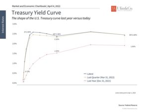
The yield curve inverted last week based on the 10-year and 2-year Treasury yields. Other measures which use shorter-dated maturities still show significant steepness. These rates will likely rise as the Fed accelerates its rate hike process.
2 Yield curves are a blunt tool for predicting recessions
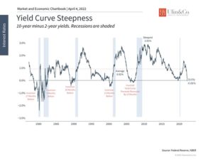
While yield curve inversions do precede recessions, they do not predict their exact timing. Over the past 50 years, recessions have occurred anywhere from 9 to 23 months after the 10-year Treasury yield falls below the 2-year – a large variation in timeframes. Additionally, there are other factors that could affect the yield curve this time around.
3 Real, inflation-adjusted interest rates are still supportive
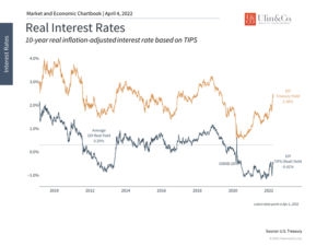
Economists often focus on “real” interest rates – i.e., interest rates after adjusting for inflation. At the moment, these real rates are still extremely accommodative. They continue to be negative which is often supportive of economic growth.
The bottom line? Interest rates are sending mixed signals based on the level and the shape of the near inverted yield curve. Investors ought to stay balanced and avoid overreacting.
For more information on our firm or to get in touch with Jon Ulin, CFP®, please call us at (561) 210-7887 or email jon.ulin@ulinwealth.com.
You cannot invest directly in an index. Past performance is no guarantee of future returns. Diversification does not ensure a profit or guarantee against loss. All examples and charts shown are hypothetical used for illustrative purposes only and do not represent any actual investment. The information given herein is taken from sources that IFP Advisors, LLC, dba Independent Financial Partners (IFP), and it advisors believe to be reliable, but it is not guaranteed by us as to accuracy or completeness. This is for informational purposes only and in no event should be construed as an offer to sell or solicitation of an offer to buy any securities or products. Please consult your tax and/or legal advisor before implementing any tax and/or legal related strategies mentioned in this publication as IFP does not provide tax and/or legal advice. Opinions expressed are subject to change without notice and do not take into account the particular investment objectives, financial situation, or needs of individual investors.


